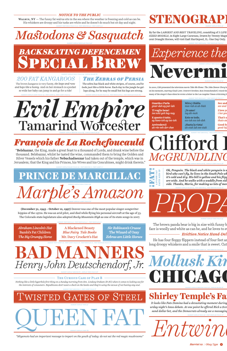
Display Sample ★ Harriet Text
Harriet Text
Bold Italic
Loading...
Harriet Text
Medium
Loading...
Harriet Text
Regular Italic
Loading...
Harriet Text
Light
Loading...
Harriet Text
Thin Italic
Loading...
Specimens & PDFs
Harriet Tabloid .pdf

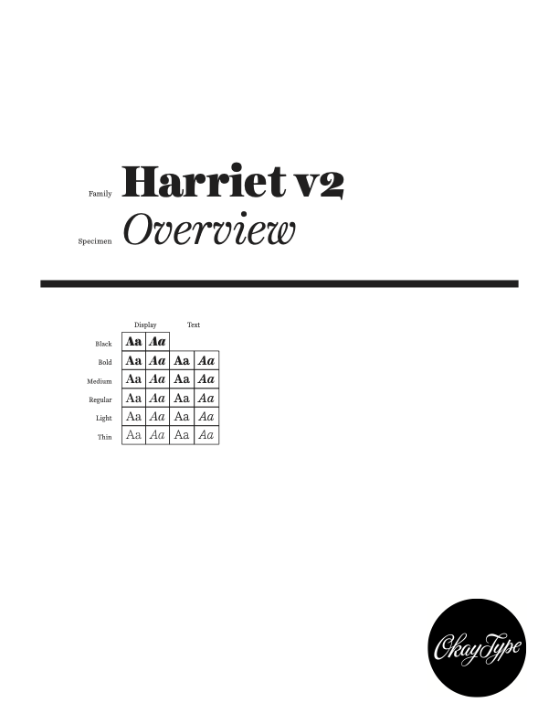
Harriet Overview .pdf
Harriet Specimen .pdf
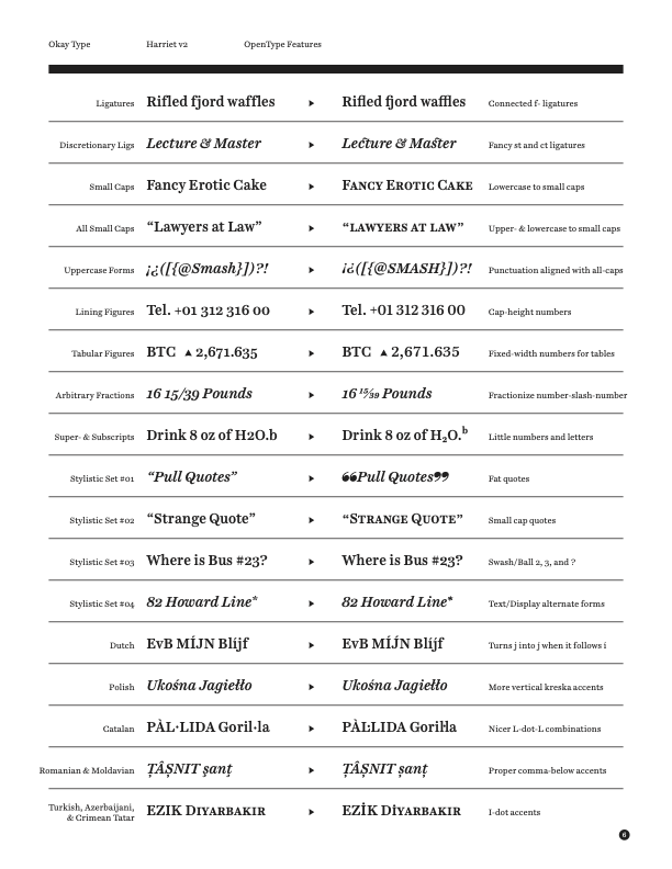
Harriet OpenType Reference .pdf
Harriet Details
| Designed by | Jackson Showalter-Cavanaugh |
| SEO Tags | Ball Terminals Baskerville Body Text Bracketed Branding Century Communication Arts Contrast Corporate Display Editorial Extended Latin Support Extra Thin Harriet Headlines Old-Style Numbers OpenType Optical Sizes Pothooks Publication Scotch Roman Serif Small Caps Superscripts Tabular Numbers Text Transitional True Italics Type Directors Club Typographica Vietnamese |
| Released | 2012 February 14 |
| Latest Version | 2.1 — 2019 September 27 — Change Log |
Harriet Change Log
✕
Version 2.1 / 2020 July 29
- Fixed accent bug in /Abrevegrave /Abreveacute /Abrevegrave.sc /Abreveacute.sc
Version 2.0 / 2019 January 1
- Major Update
- Internal changes to font metadata
- “Regular Italic” styles renamed “Italic” to meet spec
- Moved quotes to be slightly lower
- Redrew arrows and fixed misnamed northeast/southwest glyphs
- Redrew some accents
- Added localized Catalan ela geminada
- Added localized Dutch Iacute-Jacute pair
- Added support for Vietnamese
- Added stars, circles, and other ornaments
- Added Editorial Fat Quotes and OpenType Stylistic Set 01 to access them
- Added lower small-cap -aligned quotes and OpenType Stylistic Set 02 and C2SC to access them
- Added alternate text/display forms for /two /three /question /questiondown /questiondown.case and OpenType Stylistic Set 03 to access them
- Added alternate text/display forms every glyph with different size-specific forms and OpenType Stylistic Set 04 to access them
- See more in the blog post detailing the changes in version 2.0
Version 1.8 / 2015 October 20
- Updated version number metadata from internal production numbers to “1.008”
- Added lower small-cap -aligned quotes
- Fixed interpolation errors in /thorn in Text italic styles
- Redrew /florin to have a slanted form
Version 1.6 / 2013 April 22
- Fixed incorrect descender value in vertical metrics metadata
- Nudged vertical metrics
- Fixed mis-named /onequarter /onehalf
- Minor drawing adjustments to a few random glyphs in a handful of styles (/Q /m /t /ae /quotesingle /h /q /q.small /two /two.ot /f_b /f_h /f_f_h etc)
- Fixed mispositioned accent in /dcaron
- Added /lcaron /Lcaron /Lcaron.small
Version 1.5 / 2012 July 3
- Fixed incorrectly-sized dot accents
Version 1.4 / 2012 June 18
- Fixed a bunch of minor interpolation problems
Version 1.2 / 2012 February 15
- Updated licensing metadata to remove beta “For internal use only...” to “Copyright 2012 © Okay Type ...”
Version 1.0 / 2012 February 14
- Initial Release
The Latest on Harriet
2019 January 01 ☛ Harriet updated to version 2.0
View other posts about Harriet