Harriet v2 is an update to the original Harriet fonts. It has been expanded and refined from the previous 1.x versions. Some additional language support was added (most importantly was Vietnamese). A few bugs were fixed (most were very minor) and all of the outlines were touched up to improve rendering. Finally, the OpenType features were reworked and expanded.
Harriet updated to version 2.0
2019 January 01
While I’m just going to keep calling these fonts “Harriet” (unlike Alright v2, which is significantly different from the old Alright Sans), the new fonts have been named “Harriet v2 Text” and “Harriet v2 Display” to avoid any font conflicts or possible document reflow issues. 99% of documents shouldn’t reflow, but you can never be too careful
Better Fonts
The original versions of Harriet had some small bugs. Small errors in the unicode data, OpenType features, and font naming. I fixed them.
The only one you’ll probably notice is the “Regular Italic” fonts now appear just as “Italic.” I’m not a fan of it, but that’s what the specification wants. The good news is things like style-linking work much better in Office applications now.
Lower Quotes
The quotation marks have been lowered just a little bit. This looks better to me, particularly in shorter lines of text.
Clearer Arrows
I wonder if anyone ever noticed that nw/se are flipped in the original Harriet? I didn’t. Oops. I added a dent to the backside of the pointing triangles in version 2. This little detail makes a huge difference, clarifying what direction is actually being pointed at.
Touched Up Accents
I tweaked the accents just a little. It’s barely noticeable, but the originals were a little floaty. Version 2's accents are closer to the base letters and more even in color.
Additions: Localized Catalan
The L-dot glyphs were revised. Now they have a more even color and look balanced in text. Oh, and I added an OpenType localization for Catalan to automatically replace L-dot-L in strings with the better looking ela geminada.
Additions: Localized Dutch
I added pre-composed J-acute glyphs and an OpenType localization for Dutch to for Iacute-Jacute pairs. Thanks, @j_acute.
Additions: Vietnamese
Somewhere around 60 million people speak Vietnamese so I added the letters necessary to type it.
Additions: Ornaments & Symbols
In addition to the existing arrows and pointing triangles, Harriet version 2 added a few stars and a circle. Cool.
Additions: Stylistic Set #01 — Fat Quotes
I added fat editorial quotes because they’re fun. These are accessible with the Stylistic Set #01 OpenType Feature, in a glyph menu, or with unicode.
Additions: Stylistic Set #02 — Small Cap Quotes
Someone once asked me to add lower quotes that align to the Small Caps. So I did. You can turn them on by activating Stylistic Set 02. They’re also included the All-Small Caps feature.
Additions: Stylistic Set #03 — Alternate 2 3 ?
One of the most noticable differences between the Text and Display sizes are the swash terminals on the 2, 3, and ?. I added the alternate style to every font, just in case you want to switch things up. The Display fonts switch to ball terminals and the Text fonts switch to swash terminals. #useful
Additions: Stylistic Set #04 — Text/Display Alts
Did you like Stylistic Set #03? Well you're going to love Stylistic Set #04! There are a lot of little differences between the Text and Display fonts. It's most obvious in things like the italic p and the f-ligatures.
These differences are important to the size-specific design, but they are a headache for efficient font-production. The problem gets worse when you look to the future of variable fonts, which makes little glyph variations complicated and expensive (in terms of time and data).
Anyway, I drank a bunch of cough syrup and made all the size-specific glyphs compatible across the Display and Text fonts. That'll be really useful when/if a variable font version of Harriet is available. In the meantime, you can use SS04 to switch things up.
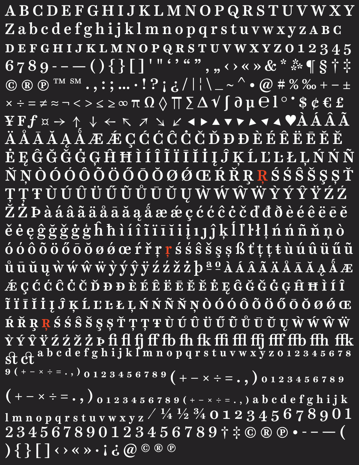
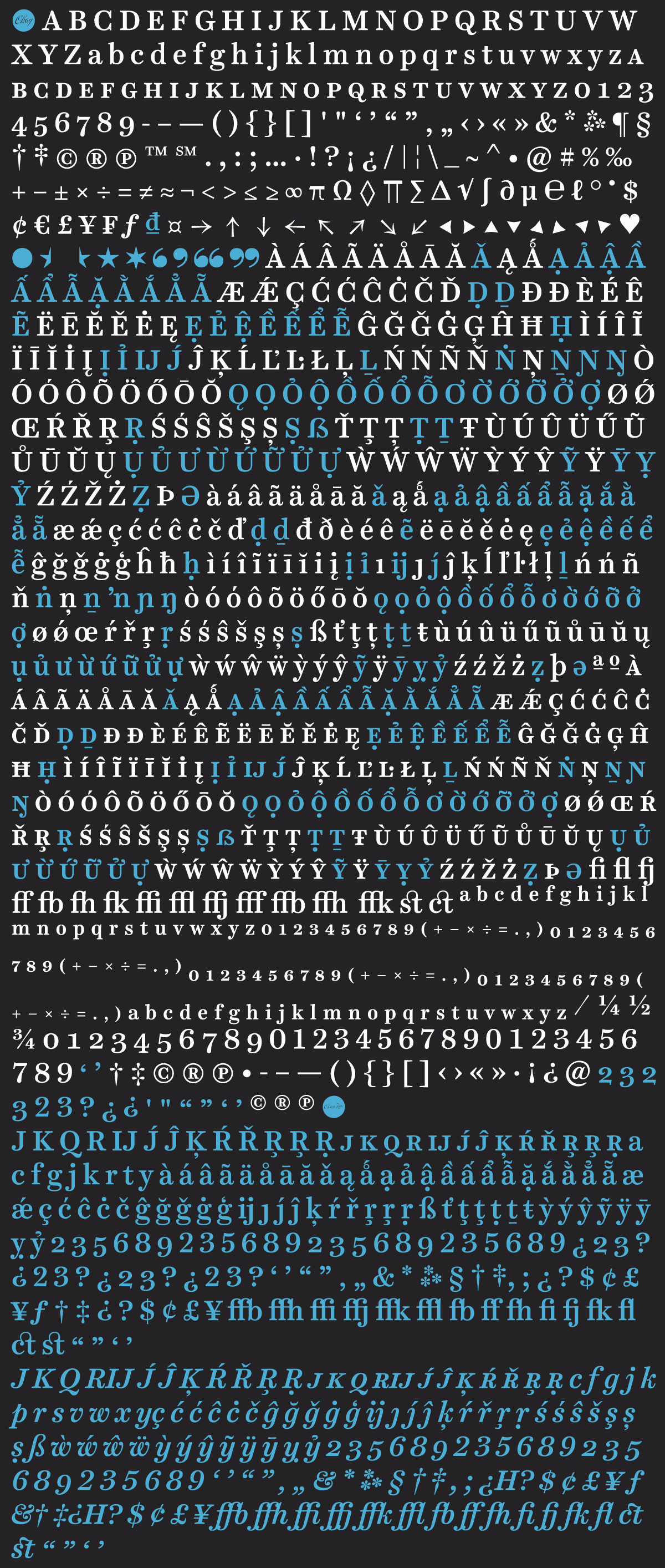
Character Set Changes
With all of these changes, it’s important to know the character set grew significantly. In addition to the new OpenType features listed above (blame #SS04 for that big chunk at the bottom), the language support now matches what's in Alright v2.
Okay, now go buy Harriet. Or download the updated files from your Account page.