Euchre
Euchre
Euchre
Euchre
Euchre
Euchre
Euchre
Euchre
Euchre
Euchre
Euchre
Euchre
Euchre
Euchre
Euchre
Euchre
Euchre
Euchre
Euchre
Euchre
Euchre
Euchre
Euchre
Euchre
Euchre
Euchre
Euchre
Euchre
Euchre
Black Bold Medium Regular Light Thin ExThin Black Italic Bold Italic Medium Italic Regular Italic Light Italic Thin Italic ExThin Italic
Euchre Condensed
Black Bold Medium Regular Light Thin ExThin Black Italic Bold Italic Medium Italic Regular Italic Light Italic Thin Italic ExThin Italic
About Euchre
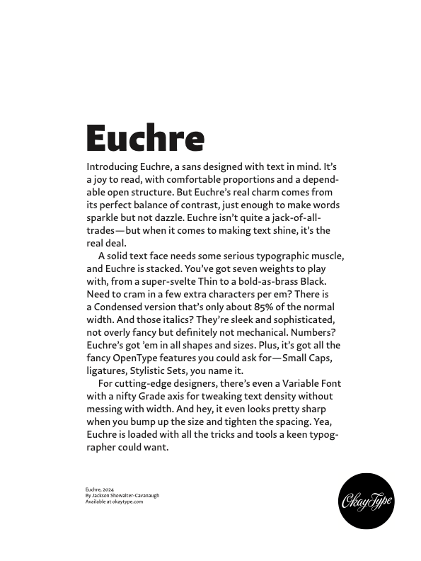
Introducing Euchre, a sans designed with text in mind. It’s a joy to read, with comfortable proportions and a dependable open structure. But Euchre’s real charm comes from its perfect balance of contrast, just enough to make words sparkle but not dazzle. Euchre isn’t quite a jack-of-all-trades — but when it comes to making text shine, it’s the real deal.
A solid text face needs some serious typographic muscle, and Euchre is stacked. You’ve got seven weights to play with, from a super-svelte Thin to a bold-as-brass Black. Need to cram in a few extra characters per em? There is a Condensed version that’s only about 85% of the normal width. And those italics? They’re sleek and sophisticated, not overly fancy but definitely not mechanical. Numbers? Euchre’s got ’em in all shapes and sizes. Plus, it’s got all the fancy OpenType features you could ask for — Small Caps, ligatures, Stylistic Sets, you name it.
For cutting-edge designers, there’s even a Variable Font with a nifty Grade axis for tweaking text density without messing with width. And hey, it even looks pretty sharp when you bump up the size and tighten the spacing. Yea, Euchre is loaded with all the tricks and tools a keen typographer could want.
Euchre won a Communication Arts type award in 2024.
Euchre ★ Specimens
Euchre Condensed ★ Specimens
Euchre Variable
Euchre is available as a variable font that gives you fine-tuned control the entire range of weights and widths. Euchre Variable even has an additional Grade axis unavailable in the static fonts. The Grade axis that lets you precisely adjustment the color of text, making it slightly darker or lighter, without changing the set width or causing a reflow.
☛ Explore Euchre Variable’s parameters with the Axes UI.
In print, you can use the Grade axis to compensate for the physical issues that come up on press. Knocking out text from a photo or dark color? Pick a darker Grade to help adjust for ink bleed. Mixing paper stocks? Nudge the Grade lighter on the uncoated pages to compensate for ink spread. Or pick a darker grade on coated paper to increase the density. Or do both.
On screens, the Grade axis is a great way to deal with the effects of glow or “light bloom” where the brightness of white text spreads over darker areas. By using a lighter value for knocked-out text and/or a heavier value for black-on-white text, you can get a much more even overall appearance.
☛ See for yourself by turning on +/– mode.
There is also a performance benefit to the Euchre Variable webfonts: the file size is around 75% smaller than the static fonts. The full family is only 640 kB versus 2700 kB. If you subset to Latin-1, that comes down to 214 kB versus 780 kB. Additionally, you only need to serve two files instead of 28. This means your server load is lighter and your users see the fonts faster.
Variable Axes
Euchre Details
Designed by | Jackson Showalter-Cavanaugh |
SEO Tags | Humanist Angled Contrast Sans Serif Variable Font Grades Axis Width Axis Weight Axis Narrow Width Condensed Width Extra Thin True Italics Body Text OpenType Features Small Caps Old-Style Numbers Superscripts Corporate Branding Editorial Publication Latin Support Extended Latin Support |
Released | 2024 February 29 |
Latest Version | 1.0 — 2024 February 29 — Change Log |
Euchre Change Log
✕- Initial Release
The Latest on Euchre
2025 February 02 ☛ Chicago Small Talk
2024 February 29 ☛ Euchre! A new text-first sans.
View other posts about Euchre
OpenType Features
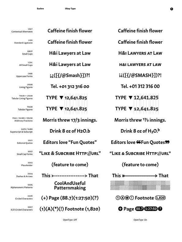
Euchre is an OpenType font with advanced typographic features like Small Caps and alternate figure styles. These features make it easy to typeset nice-looking blocks of text. Click each preview to toggle the feature on/off. Get more detailed information by clicking the (?) icon in the corner.
The SMCP feature turns lowercase letters into small caps.
smcp can be applied to blocks of text or to individual characters.
Read more about smcp on the OpenType smcp Spec
C2SC turns UPPERCASE into small caps. It’s useful for styling things like subheads and dressing up acronyms in running text. C2SC doesn’t touch lowercase so you might want to combine it with SMCP or CASE. Adobe combines the two in their OpenType menu as “All Small Caps”.
In Euchre, C2SC also turns on a few alternates designed to align better with all small-cap text. It lowers the quotes to better align with all small-cap text (“test” → “Test”) and turns on alternate forms for the ampersand (s&m → s&m) and slash (http:// → http://).
c2sc can be applied to blocks of text or to individual characters.
Read more about c2sc on the OpenType c2sc Spec
The LIGA feature controls standard typographic ligatures like fi. Ligatures usually improve the spacing and color of text by fixing troublesome letter pairs that either collide or make awkard spaces.
Euchre has pre-built fi, fj, fl, fb, fh, and fk ligatures. Additionally, there is narrower alternate f that is used to make tidier f-f pairs like ffi, ffj, ffl, ffb, ffh, ffk, fff, and ff.
liga can be applied to blocks of text or to individual characters and should be on by default.
Read more about liga on the OpenType liga Spec
The CALT feature changes the form of some characters when they appear next to other characters so they look better together.
Euchre has an alternate f with a shorter arm to avoid awkward collisions when next to tall characters. There’s also a contextual long s if you’re naſty.
calt can be applied to blocks of text or to individual characters and should be on by default.
Read more about calt on the OpenType calt Spec
The CASE feature shifts some punctuation and symbols to align better with all-cap text. In Okay Type fonts, CASE also changes the numbers from old-style to lining (1234 → 1234). In most Adobe apps, you can quickly apply CASE with ⌘+K. In CSS, you will need to include “text-transform: uppercase;”.
Euchre has CASE alternates for these common punctuation and symbols: -‒–—―⁓()[]{}⟨⟩‹›«»¡¿⸘~@+−±÷×=<>≤≥≈≠¬∞¢.
case can be applied to blocks of text or to individual characters.
Read more about case on the OpenType case Spec
#1 Grade Cruciferous Vegetables
Reference Lot #42-3569A0³⁶
The LNUM feature accesses lining-height numbers that are align to height of the capitals (0123456789 → 0123456789). In Okay Type fonts, default numbers have proportional widths, so LNUM will need to combined with TNUM to get the tabular-width forms (0123456789 → 0123456789).
Euchre’s LNUM has slightly different forms for 3569. For consistency, these forms also change in the superscript, subscript, and arbitrary fraction numbers. Hot Tip: Because Okay Type fonts duplicate the LNUM feature in CASE, you can use ⌘+K in most Adobe apps to quickly apply Lining Figures.
lnum can be applied to blocks of text or to individual characters.
Read more about lnum on the OpenType lnum Spec
0% | 2 | mg | Vitamin A equiv. |
48% | 0 | .04 mg | Thiamine (B1) |
12% | 0 | .05 mg | Riboflavin (B2) |
3% | 11 | .14 mg | Niacin (B3) |
31% | 20 | .165 mg | Pantothenic acid (B5) |
120% | 0 | .15 mg | Vitamin B6 |
The TNUM feature gives you tabular width numbers. These are useful when you need to neatly align information vertically, like on a chart, spreadsheet, or schedule. In CSS, you can combine TNUM with LNUM to get tabular lining numbers (0123456789). Adobe apps pre-combine LNUM and TNUM in the OpenType menu as "Tabular Lining Figures."
TNUM numbers in Euchre have the same width across all of the weights, so you can set Thin with Black and maintain alignment. In there are also tabular alternates of some punctuation marks ('"·.,:/). These can be useful when those characters appear adjacent to or in-between numbers (some are half-width, fwiw).
tnum can be applied to blocks of text or to individual characters.
Read more about tnum on the OpenType tnum Spec
The FRAC feature replaces number-slash-number sequences with numerator-solidus-denominator fractions. Okay Type fonts use Tal Leming’s Contextual Fraction Fever Method, which works on blocks of text and handles edge-cases fairly well (e.g.: “I drank 29 178/290 beers on 3/17/2008”).
While Euchre’s numerators and denominators are all the same height, there are alternate forms of 3569 that match the LNUM forms. (13,569 35/69 → 13,569 35/69). How’s that for Typographic OCD?
frac can be applied to blocks of text or to individual characters.
Read more about frac on the OpenType frac Spec
The SUBS feature replaces some characters, usually numbers, with inferior forms that are smaller and hang below the baseline. Most of these are unicode encoded but sometimes it’s necessary (or easier) to use the OpenType feature.
Euchre has subscripts for 0123456789(+−=). Don’t forget to combine SUBS with LNUM to keep the numbers consistent (13xO₃ → 13xO₃).
subs should be applied to individual characters.
Read more about subs on the OpenType subs Spec
The SUPS feature replaces some characters, usually numbers and letters, with superior forms that are smaller and raise above the cap height. Most of these are unicode encoded (why no q?) but sometimes it’s necessary (or easier) to use the OpenType feature.
Euchre has superscripts for lowercase a−z, numbers 0−9, and a few symbols (+−=). Don’t forget to combine SUPS with LNUM to keep the numbers consistent. (3569³⁵⁶⁹ → 3569³⁵⁶⁹)
sups should be applied to individual characters.
Read more about sups on the OpenType sups Spec
Stylistic Sets vary from font to font.
In Euchre, SS01 replaces normal quotes (‘“”’) with chunky dingbat quotes (❛❝❞❜). Sure, these are unicode encoded (275B–E), but having them accessible in an OpenType feature makes it dead-simple to use (and avoids re-encoding the underlying text string when all you really want to do is stylize some quotes—hooray accessibility!).
ss01 can be applied to blocks of text or to individual characters.
Read more about ss01 on the OpenType ss01 Spec
Stylistic Sets vary from font to font.
SS02 is another way to access Euchre’s alternate small-cap forms, allowing you use them outside of the C2SC feature. Potentially useful in in traditional initial-cap Small-Caps/smcp text. Or as a way to spice up & fine-tune original recipe text.
ss02 can be applied to blocks of text or to individual characters.
Read more about ss02 on the OpenType ss02 Spec
Stylistic Sets vary from font to font.
In Euchre, SS03 doesn’t do anything. Yet... I have plans.
ss03 can be applied to blocks of text or to individual characters.
Read more about ss03 on the OpenType ss03 Spec
No<---Maybe-->Yes
___Fine <-< <--< <---<
Stylistic Sets vary from font to font.
In Euchre, SS04 turns repeated underscores ____, hyphens ----, en-dashes ––––, or em-dashes ———— into connected lines. You can add greater-than and lesser-than signs to either end to turn those lines into arrows (e.g., <-->). SS03 also stacks with CASE to get uppercase-aligned arrows. Cool? >-----------> Umm, yeah! <-----------< Be careful though, automatic hyphenation can break an arrow if you’re not careful (on the web you can avoid this with “white-space: nowrap;”). Oh, and some rendering engines have a stupid bug that makes the line look a tiny bit heavier where the pieces overlap. Womp womp.
ss04 can be applied to blocks of text or to individual characters.
Read more about ss04 on the OpenType ss04 Spec
Stylistic Sets vary from font to font.
In Euchre, SS05 turns letters (a–z) and numbers (0–9) into patterns based on their base characters. To make the effect work, you’ll need to set the line-spacing solid. In CSS, use “line-height: 1em;”. In Adobe apps, set the leading to match the font size.
ss05 can be applied to blocks of text or to individual characters.
Read more about ss05 on the OpenType ss05 Spec
Stylistic Sets vary from font to font.
In Euchre, SS06 creates special index characters outlined in an circle. There are individual for characters for uppercase letters (A–Z), numbers (0–9), a few symbols (!?+-/_*), and arrows (←↑→↓↔↕↖↗↘↙). The letters and numbers are unicode encoded but the symbols are not. You can access both in SS05 contextually by enclosing the character in parenthesis: (?) → (?). You can also create longer circled numbers by enclosing them in parenthesis. This feature also works with a few separator characters (.,+-:;/_) : (9,876.54+1) → (9,876.54+1).
ss06 can be applied to blocks of text or to individual characters.
Read more about ss06 on the OpenType ss06 Spec
(102.7) Hard Rock
Stylistic Sets vary from font to font.
In Euchre, SS07 acts the same as SS06, except the characters are knocked out of a solid black circle.
ss07 can be applied to blocks of text or to individual characters.
Read more about ss07 on the OpenType ss07 Spec
Character Set
Uppercase
Lowercase
Small Caps
Punctuation & Symbols
Figures
Proportional Lining Figures
Tabular Lining Figures
Tabular Old-Style Figures
Currency Symbols
Superscripts
Subscripts
Symbols
Fractions
Uppercase-Aligned Forms
Connected Dashes & Arrows
Patterns
Circled Characters
Language Support
Euchre supports:
Determining which languages a font supports is complicated. This data is not comprehensive and is likely not 100% accurate. I welcome any corrections, additions, or questions: ok@yty.pe
This list of supported languages comes from Apple’s Font Book. The character information for each language comes from Unicode's Common Locale Data Repository. I last updated it on November 6, 2023. Additional data comes from a variety of sources which are included under “References”.
Some of this data uses OpenType combining accents, may not be fully supported in every browser (looking at you, Safari). The uppercase characters are generated using Javascript’s toLocaleUpperCase() method, which isn’t foolproof either.
Some Okay Type fonts are listed as supporting a language but may not include all of the Auxiliary Characters (e.g.: the Ɑ and ɑ in Galician). Reach out if these are something you really need.