Alright Sans was a pretty successful typeface, but it had some technical and conceptual issues that needed to be fixed. The Alright Normal width of Alright v2 was redrawn from scratch to address those issues. I think it’s a much better typeface, but the differences might seem subtle. Here is a side-by-side comparison of the two fonts to help explain what changed.
Alright Sans vs Alright v2
2019 January 01
Important: The Fonts Are Not Interchangeable
When upgrading documents from Alright Sans to Alright Normal, please be aware that the spacing, weights, character sets, features, and letterforms are all different. Your documents will probably reflow. Things will look a little different, almost certainly for the better. I know this is annoying but there was no way to avoid it. I think the improvements are worth it.
Spacing Changed
The spacing of the new fonts is different. Your documents will reflow. Alright Normal is a little tighter overall. The heavier weights are a little narrower (some characters changed a lot, see the W above or the M below). You might want to consider adding a little extra letter-spacing or tracking to small text.
Heavier Weights Look Better
I redrew everything in Alright Normal. This is most noticeable in the heavier weights, which have improved significantly. Some of characters in the Alright Sans were a bit wonky, with some awkward curves and heavy spots. The heavy weights of Alright Normal are much better, maintaining the warmth of the original design without looking quite so awkward, cramped, or dumb.
Redesigned Commas & Quotes
The comma and quote marks have changed from the clunky box-with-a-tail to a simpler curved stroke. This new form reinforces the humanist quality of the design and it works better across the entire range of weights and widths.
Redesigned f-Ligatures
The f-ligatures have been changed. Most noticeably, Alright Sans had a quirky futura-inspired round-over in the fl ligature. Why did I play up a geometric form in a not-really-geometric font? I don’t know. Alright Normal has much better ligatures that fit the humanist-gothic design concept. They are less distracting and more legible.
Redesigned Punctuation
All of the punctuation and symbols have been redesigned. Alright Sans had some forms that ended up looking a little strange in the real world. For Alright Normal, I redrew them to be much more, umm, normal. They work much better.
Redesigned Currency Symbols
The default currency symbols in the original Alright Sans were designed to match the old-style figures. It was a fun idea but maybe this probably wasn't the right place to have a fun idea. Alright Normal has boring currency symbols, drawn full-height. They look much better with both old-style figures and lining-figures.
Other Numeric Symbols Redesigned
Similarly, the other odd symbols from Alright Sans were redrawn and improved. Ooof, some of these old fonts are kind of painful to look at.
Redesigned Fractions
One person complained about the fractions in Alright Sans. They had a point. I drew the new fractions much larger. They are more legible in text sizes, where fractions are used most. Alright Normal includes a full set of pre-composed fractions (well, the ones in unicode) and an OpenType feature for arbitrary fractions.
Redesigned Super- and Sub- scripts
Similarly, the small letters and numbers used for superscripts, subscripts, and ordinals have also been drawn much larger. The old versions were anemic in text, making them hard to distinguish. The new versions work much better in text sizes, where they are used most.
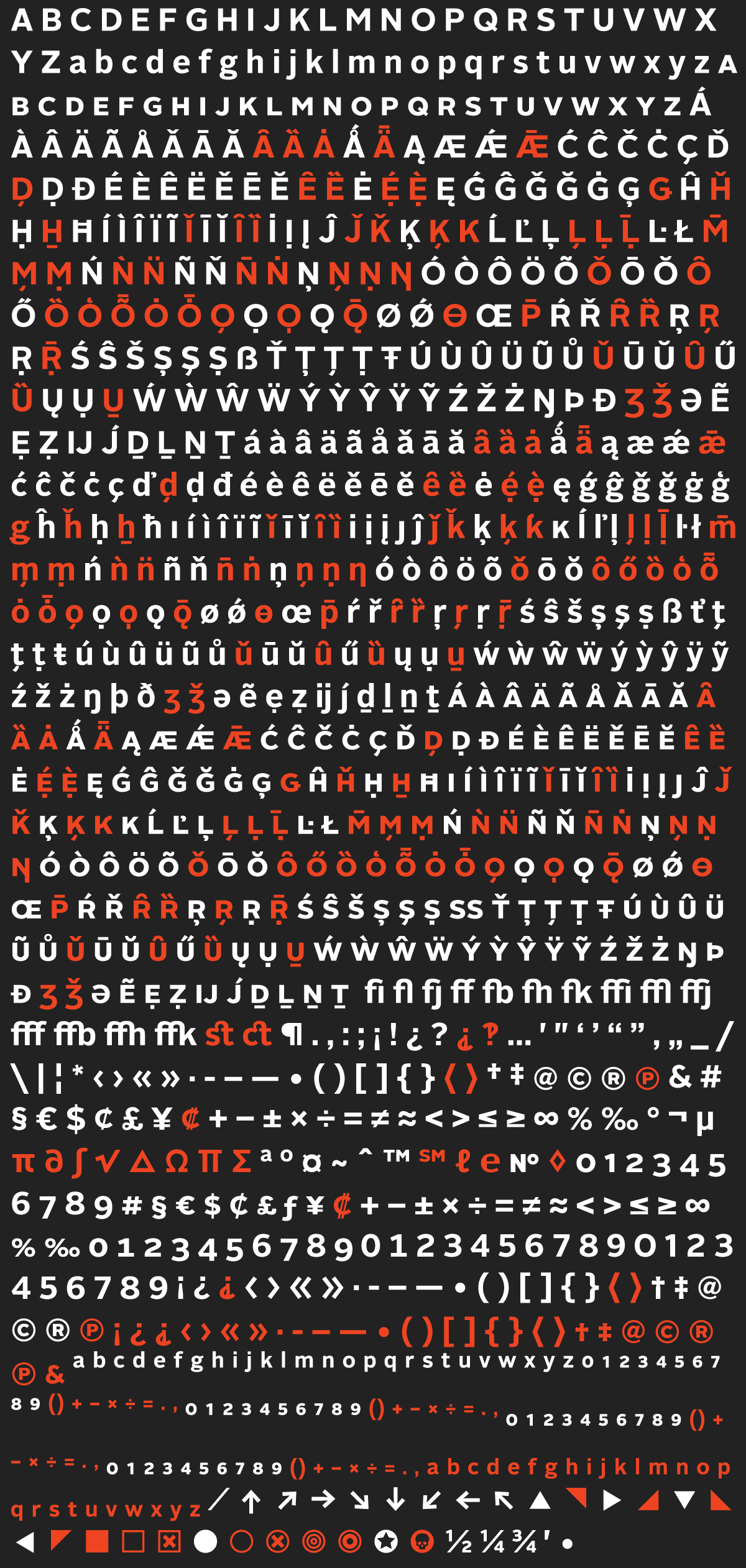
Character Set Changes
I changed the character set in Alright Normal. The original character set was pretty large, but it contained some things that were rarely used (well ok, never used, if we're being honest). There were also a lot of things used in features that weren’t necessarily a good idea (small-cap aligned punctuation anyone).
In addition to dropping some of the cruft, Alright Normal added characters I know will be more useful. There are more currency symbols, new ornaments and UI elements, and a full set of pre-built fractions.
Language-wise, Alright Normal added some useful contextual alternates, support for Vietnamese, as well as a few other Latin languages. Check out the Overview PDF for a closer look.
Vietnamese Support Added
I think somewhere around 60 million people speak Vietnamese, so I added support for it. The stacked accents are a bit of challenge (particularly in the narrow widths and heavy weights), but it’s actually pretty fun to draw.
New Contextual Alternates
It’s surprising how many people turn off ligatures. I get it, sometimes they can be a little too fussy. Unfortunately, the f, j, and t have long-ish horizontal strokes that can make for some awkward near-collisions. Alright Normal uses the Contextual Alternate OpenType feature to automatically swap in shorter forms when necessary to help keep un-ligatured text looking tidy.
More Ornaments & Symbols
In addition to the existing arrows and pointing triangles, Alright Normal added some more symbols. No real rhyme or reason, just some things I wanted to use and some other things I thought would make drawing more fun. I'm particularly in love with the pointing fists (the left-pointer is a throwback to Victorian broadsides where printers just flipped the right-pointer).
Added Fat Quotes — Stylistic Set #01
I also added fat editorial quotes to Alright Normal. Blame Nick Sherman and Frank Grießhammer, who always use them in chat. You can use them by turning on the Stylistic Set #01 OpenType feature (which replaces normal quotes), selecting them from a glyph menu, or, if you work like a caveman, copy/pasting the unicode characters: ❛ ❜ ❝ ❞
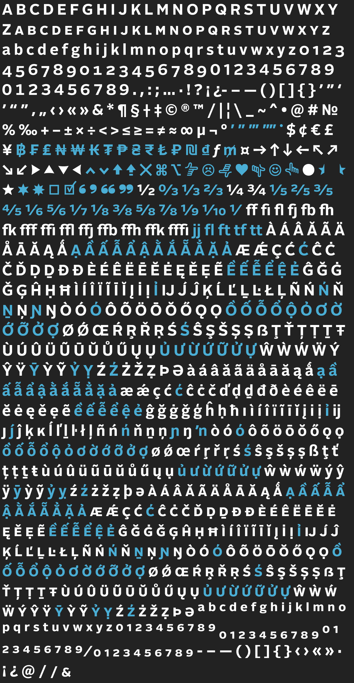
New Widths
The whole ‘redraw everything’ happened because I wanted to expand Alright to include some condensed widths. In addition to the completely redrawn and revised Alright Normal, there are three new widths, Narrow, Condensed, and Compressed.
I'll write more about them in the future, but for now the design concept is pretty simple: They’re narrower versions of Alright. They are still a humanist-gothic hybrid but the forms get a little more gothic as they get narrower.
Every width has the same number of weights. And every font has the same character set and the same OpenType features. This makes a typographic system that is really flexible, letting you easily switch between weights and widths without messing everything else up, a useful feature for design explorations and responsive layouts. It also means there are things like Compressed Ultra Italic Small-Caps. First person to use those gets a free beer.
Okay, now go buy Alright v2.