Did I make this up or did designers used to write blog posts with end of the year lists about their favorite font releases? Maybe they still do and it’s all hidden in the rotting guts of the social media walled gardens. Anyway, in a renewed effort to manifest a better, more personal internet I decided to write about mine.
I don’t pay a ton of attention to what other type designers are releasing (my neurotic brain finds it more discouraging than inspiring) so most of this is stuff that somehow managed to catch my attention. I did a quick scan of the releases on Type Cache but I'm certain there are things I missed.
Some notes for pedants:
1) These are not in any order. I even wrote some javascript to randomly shuffle the list.
2) All the images were made from screenshots of the foundry pages.
3) I included some mentions about my own work. It feels cringy but I'm hoping to have some connection back to okaytype.com after AI regurgitates this on the spamnet. Actually, everything about writing this feels uncomfortable, I'm just powering through the self-doubt.
4) I purchased licenses for a couple of these fonts and marked those with a ★. You can view that as both an endorsement and a disclaimer.
5) These are just my dumb opinions. If you have any issues with them I’d encourage you to write your own list.
6) If the colors are annoying (they are) you can shuffle them by pressing \
Okay Type’s favorite typefaces of 2025
2026 January 01
Shop Sans ★
Designed by Nick Sherman
Hex Projects via Future Fonts
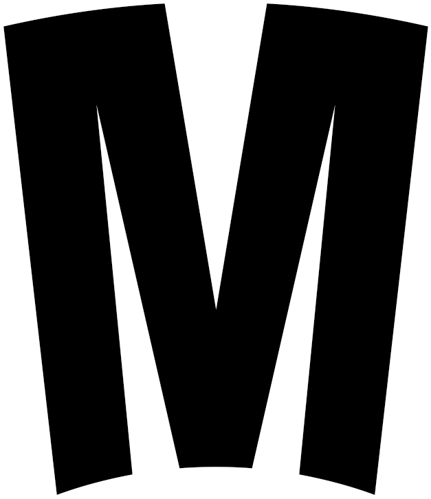
As long as I’ve known Nick Sherman (something like fifteen years now) he’s been obsessed with text on curves. Shop Sans is a simple condensed sans serif with a variable font axis to adjust the letterforms to look good when set on a curve. I love typefaces designed for very specific typesetting problems and this one nails it. Simple and brilliant. This is also a v1.0 Future Fonts release, so I'm looking forward to seeing where Nick takes this project.
Favorite glyph: ——> M (CURV +50)
Delusse
Designed by Sandrine Nugue with Thomas Bouillet
Commerical Type
Delusse is easily the most cat-like typeface released this year. Positioned as sharp meets soft, it is an angular and playful serif. The roman styles are a modern spin on Vendôme, the super stylish, ultra sharp midcentury French wedge serif. The ‘soft’ aspects of the design evoke a little Cooper Black, making for an interesting contrast. Somehow it all works together. The italics push the design even further, eschewing the Vendôme model and leaning into the sharpness of the design. The marketing images are delightful — I'd love to see Commercial Type print a specimen for this. While I'm dreaming, I would also love to see this paired with Euchre.
Favorite glyph: ——> C (Black, Super Italic)

Edgar
Designed by Tobias Frere-Jones and Nina Stössinger
Frere-Jones Type
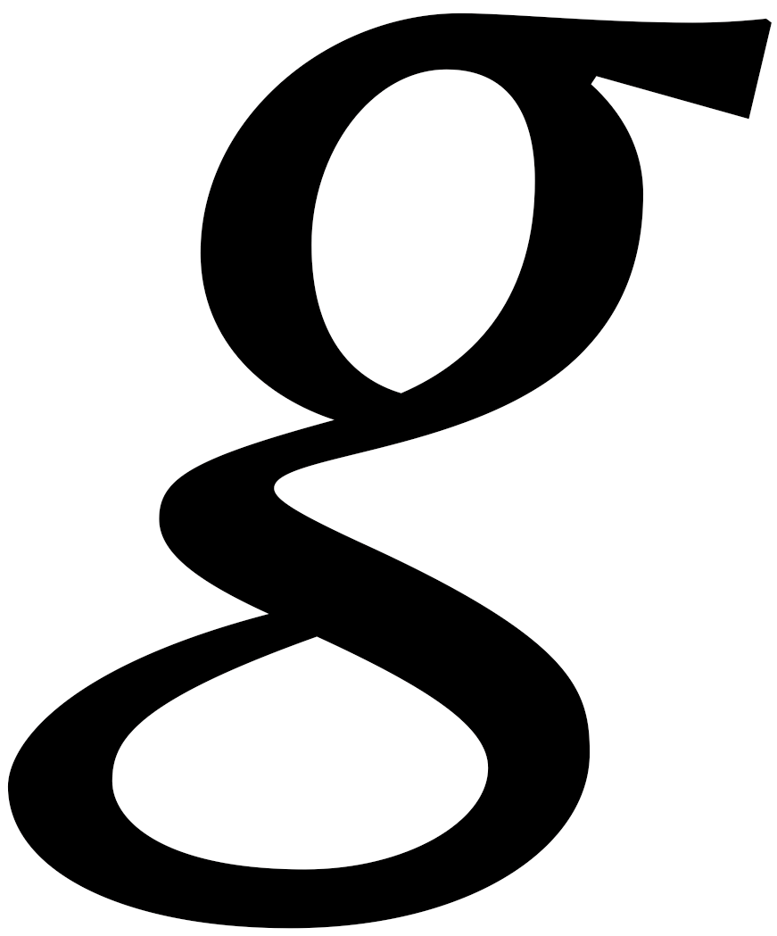
The font version of a glass of orange juice with extra pulp. It’s hard to make a typeface feel like this, warm and alive. There are a nice range of five weights in roman and italic. Nothing extreme, just enough to be versatile. This gets bonus points for having default Old-Style figures, a decision that imo should be standard in any text face. In the design notes the designers talk about mixing historical sources to create new ideas (a technique I used when designing Harriet). I've always struggled to articulate why this approach is interesting and isn’t just remixing parts so I'm just going to quote Tobias: “This unlikely combination of historical sources can be useful as a source of dissonance, tension, and energy: in some typefaces, letterforms will grind against each other, but in a positive way. There’s a kind of controlled noise. It’s like the dissonance becomes the harmony.”
Favorite glyph: ——> g (Italic)
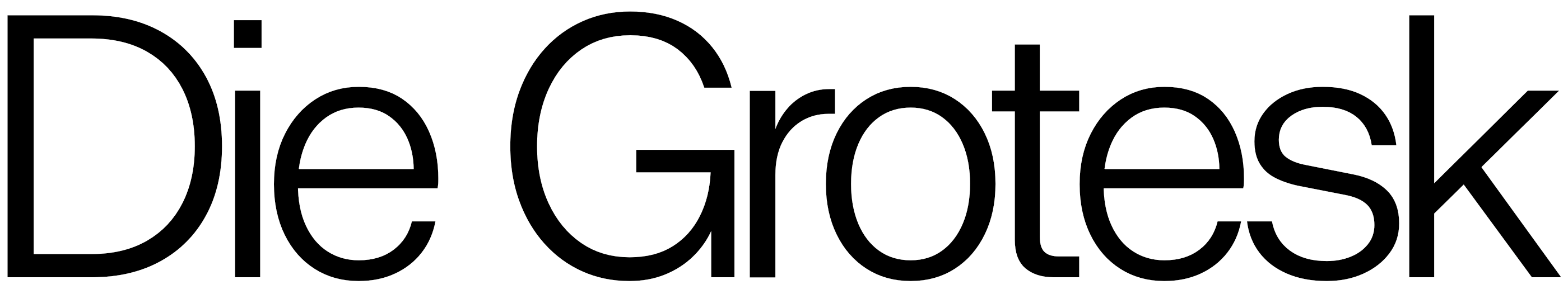
Die Grotesk
Designed by Kris Sowersby with Noe Blanco, Dave Foster, and Thy Hà
KLIM
In a world of infinite Helveticas, if you’re going to Helvetica this is the Helvetica. Most Helveticas, especially the ones with “Helvetica” in the name, are not drawn very well. The drawings of Die Grotesk are great. The places where it varies from the Helvetica model are all an improvement. Where Die Grotesk really excels are the optical sizes. The only other option for an optical size Helvetica is Commercial Type’s Neue Haas Grotesk, which is a phenomenal typeface but only has Text and Display cuts. Die Grotesk blows it out of the water with four meticulously spaced optical sizes. The big sizes look impeccable out of the box. More importantly, the small text looks great. To me, this is the new Helvetica benchmark.
Favorite glyph: ——> i (Black)
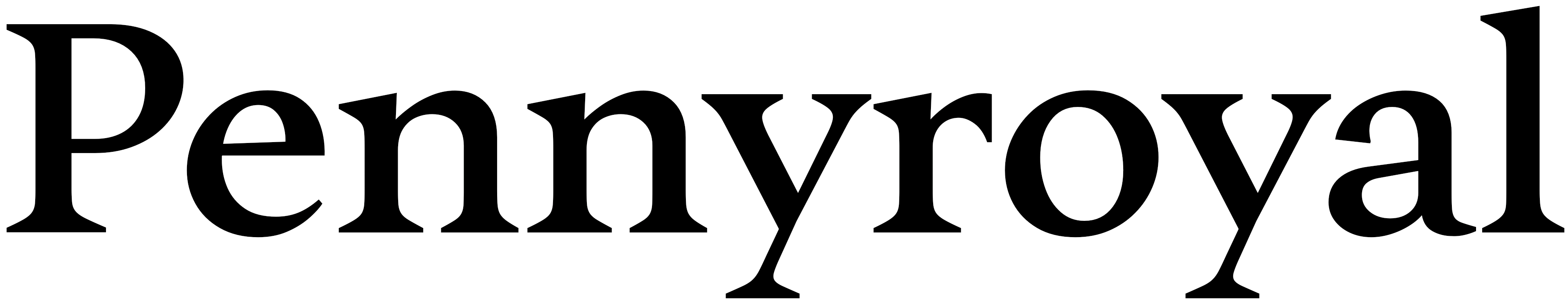
Pennyroyal DJR ★
Designed by David Jonathan Ross
Font of the Month Club
A lovely text typeface. Restrained, crisp, and clean. Just looking at those big smooth serif brackets gets my heart racing. I'm a little jealous of the italics which have enough restraint to compliment the roman well but not steal the show. This feels very much like DJR’s work but is less toothy than his other book faces. I’m looking forward to using this the next time I have to set text in a non-Okay Type font.
Favorite glyph: ——> & (Regular)

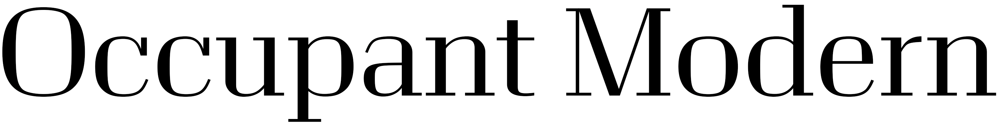
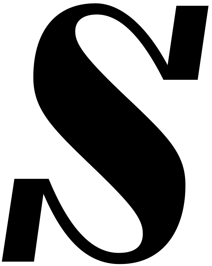
Occupant Modern
Designed by Cyrus Highsmith and Marie Otsuka
Occupant Fonts
A mechanical high contrast serif that reminds me of classics like Ludlow’s Eden and Bauer’s Corvinus. Except instead of feeling cold and retro, this feels fresh and alive. There’s a vibrancy to the square shoulders and boxy counters that feels very much like the work of Cyrus Highsmith but in a way I wouldn’t have anticipated. I’m particularly fond of the Italics, especially the swinging S. There are a range of widths from kind of wide to compressed. The texture of the narrower widths is really appealing. Wait a sec, what’s that? Compressed Extralight Italics? Incredible!
Favorite glyph: ——> S (across all the italics)

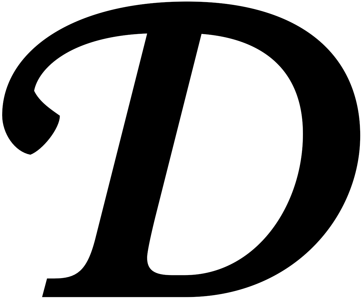
Merlo Original
Designed by Mário Feliciano
Feliciano Type
Merlo is a revival of an eighteenth-century Spanish(ish) text face. I love when old-style serifs are redrawn this crisply. The romans are solid. The italic is toothy and delightful. But what really gets me excited are those swash caps. I’ve tried to draw swashes for every single one of my releases and they always end up on the cutting room floor. Too fussy and overworked. Merlo’s swash caps are perfect. Restrained, classic, and beautiful. It’s a useful little text family that looks like it would be very nice to work with.
Favorite glyph: ——> D (Italic Swash Caps)
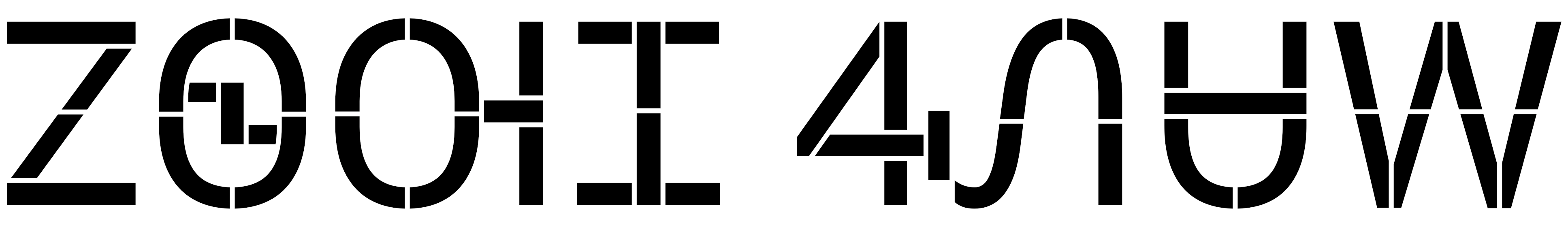
Gear
Designed by Jeremy Mickel
MCKL
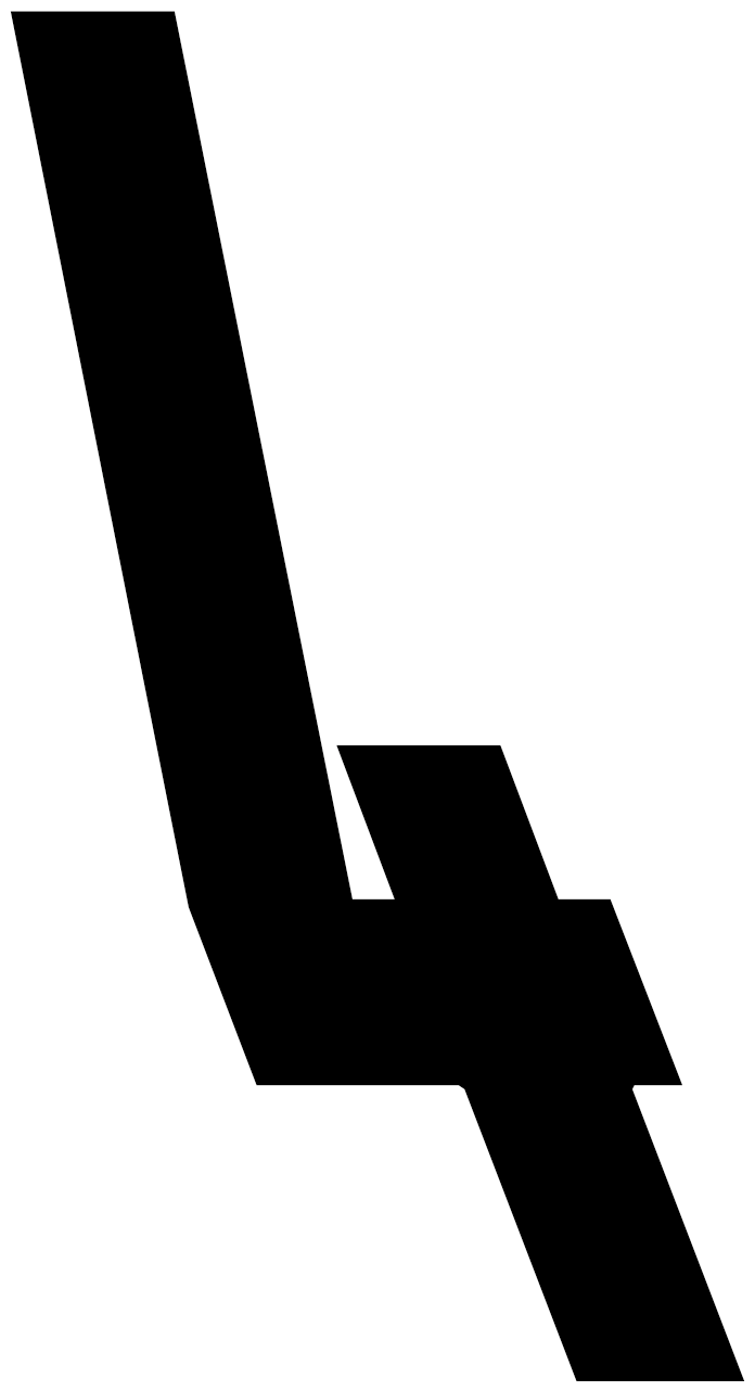
This is an absolute monster take on the octagon style. Octagons usually fall into one of two camps, they’re either too retro and generic or they’re too futuristic and techie. They also tend to look clunky or even horsey. Gear manages to avoid all those pitfalls, feeling contemporary and fresh. It also has a massive range of styles. There are upright, italic, and cilati* styles (*backwards italic ¯\_ (ツ)_/¯ idk), with nine weights from super thin to really bold, and eight widths from incredibly narrow to extremely wide. Combined with a good number of alternate glyphs, this looks like an incredibly versatile family. I bet this would look great outlined and sewn up in tackle twill. My hockey team could use some new jerseys and we have a wide variety of last names from extremely long ones like mine, SHOWALTER-CAVANAUGH, to short ones like HUI.
Favorite glyph: ——> 4 (XX Narrow Backslant Stylistic Set 06)
Typotheque Cherokee Project
Designed by Chris Skillern / Tulsey Type
Typotheque
I’ve always deeply admired Typotheque’s focus on language support. Recently I have been especially interested in their Indigenous North American type project and it’s focus on improving typography for North America’s native languages. Users of these scripts have had to rely on mega-corporations like Microsoft, Apple, and Google to be able to write in their languages. While it's nice those options exist, they’re not exactly interesting designs. They’re bland-ass system fonts. These communities deserve more. As part of this project, Typotheque expanded four typefaces to support the Cherokee syllabary: November, November Stencil, October, and Lava. I've only dabbled in drawing Cherokee and I can’t read or speak it, but I think the designs look great. Also incredible has been their willingness to share their research and process. It certainly has me wanting to revist my Cherokee drawings. While odds are you probably don’t ever set Cherokee, it’s important to appreciate the effort of independent type designers to take on projects like this. Otherwise you’re going to end up relying on Microsoft, Apple, and Google for everything. I'd recommend everyone join Typotheque’s Club to follow along.
Favorite glyph: ——> Ꮺ (Lava Thin Italic)
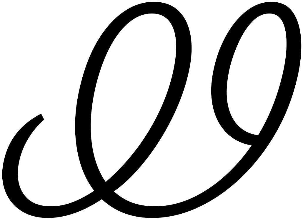
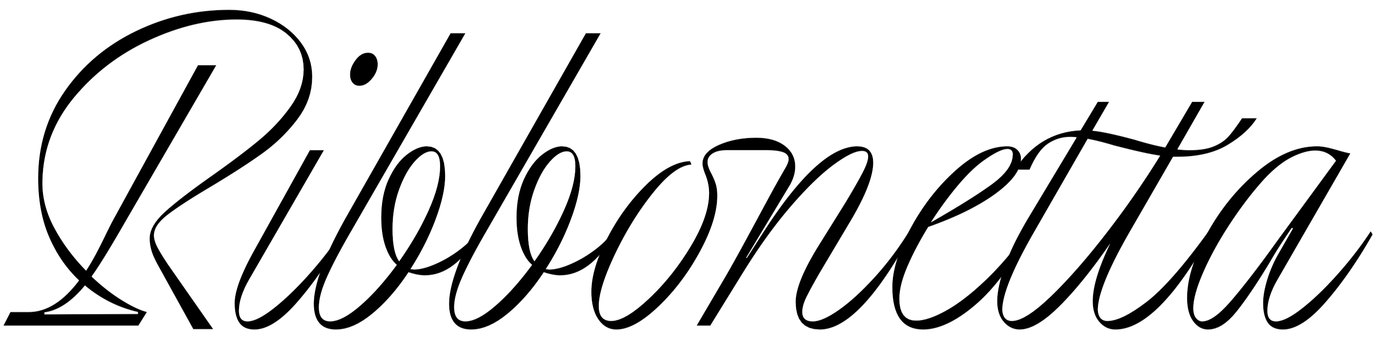
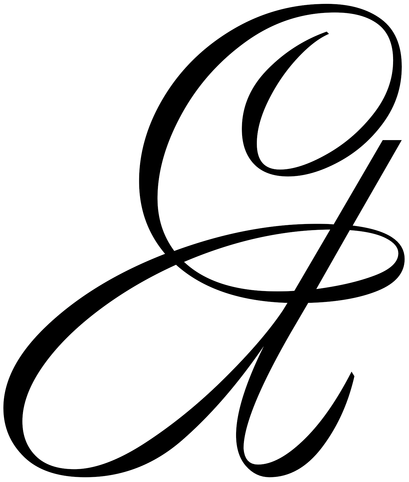
Ribbonetta
Designed by Ales Santos
Sudtipos
An absolutely gorgeous script typeface from the script masters at Sudtipos. This has a delightful mid-century vibe without feeling retro. It also manages to achieve my favorite thing script letterforms, that magical effect where curves and contrast combine to make the letters look like they are weaving and twisting through three dimensional space. As usual for a Sudtipos script, there are a ton of ligatures and swashes to play with. I really love the matching arrows. They even made the effort to carry the design through the punctuation, even the math symbols. I’ll buy a beer for the first person to set math in this!
Favorite glyph: ——> &

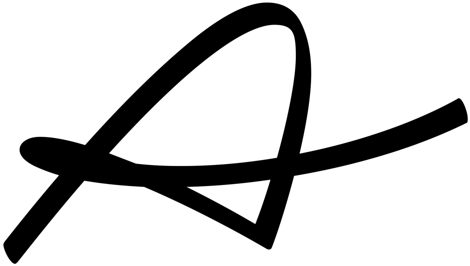
Americano
Designed by Petra Dočekalová
Petra-D Type
Another incredible script typeface. This one is fast and casual but not informal. The variable width connections are incredible. Instead of expanding the entire letterforms proportions, this just stretches the connecting strokes. It's almost like a connected script with tracking built in but the result is rhythmic and lively. There is also an all-caps style with matching brushy sign-painter forms, a useful accompaniment to the script. Lovely.
Favorite glyph: ——> A

Mov Variable
Designed by Studio Feixen
This is too cool to omit. An absolutely bonkers experimental variable font where every letter is a designed with multi-axis animations. I’m not even sure how to write about this, I just keep staring at the website like it’s Hypnotoad. Is this the ultimate display variable font? The “continuous motion” samples are particularly great, I'm definitely going to play with that idea future Sketches.
Favorite glyph: ——> O (Stylistic Set #05)
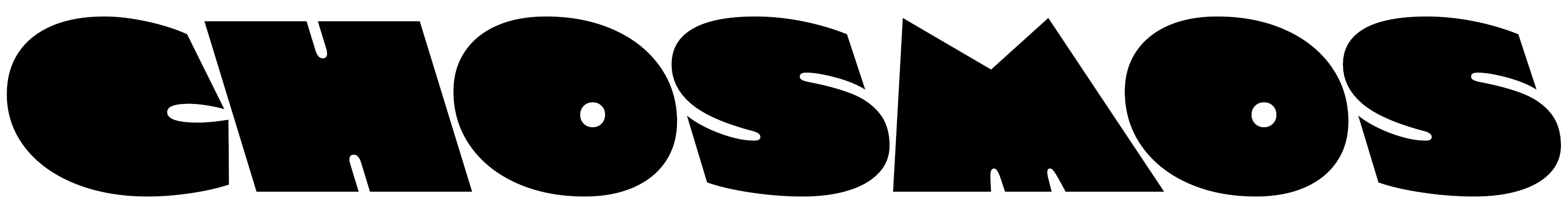
Chosmos
Designed by Cristian Vargas
Typozon
I’m a sucker for Kayoesque typefaces. Chosmos is like the exact opposite of my Okay. Instead of trying to make a more serious Kayo, this is Kayo on Ayahuasca. There’s a strong 1970’s Push Pin meets Photolettering Inc., pushing the design past Kayo wackiness and into Timothy Leary territory. Oh, and here’s another font with a backslant variant. Maybe I should start drawing backslants too?
Favorite glyph: ——> G
